摘要
Plotly 类库提供了一个可交互的,出版级别的在线图形库。Plotly 绘制的图形是以 HTML 页面的形式提供的,基于 JavaScript 提供交互功能。
下面提供了一些图形的示例,包括折线图、散点图、区域图、柱状图、箱线图、直方图等。
1. 数据准备
数据来源:https://www.kaggle.com/mylesoneill/world-university-rankings
加载数据:
1 | import pandas as pd |
打印结果:
1 | <class 'pandas.core.frame.DataFrame'> |
查看数据:
1 | print(timesData.head(10)) |
打印结果:
| df_num | world_rank | university_name | country | teaching | international | research | citations | income | total_score | num_students | student_staff_ratio | international_students | female_male_ratio | year |
|---|---|---|---|---|---|---|---|---|---|---|---|---|---|---|
| 0 | 1 | Harvard University | United States of America | 99.7 | 72.4 | 98.7 | 98.8 | 34.5 | 96.1 | 20,152 | 8.9 | 25% | - | 2011 |
| 1 | 2 | California Institute of Technology | United States of America | 97.7 | 54.6 | 98 | 99.9 | 83.7 | 96 | 2,243 | 6.9 | 27% | 33 : 67 | 2011 |
| 2 | 3 | Massachusetts Institute of Technology | United States of America | 97.8 | 82.3 | 91.4 | 99.9 | 87.5 | 95.6 | 11,074 | 9 | 33% | 37 : 63 | 2011 |
| 3 | 4 | Stanford University | United States of America | 98.3 | 29.5 | 98.1 | 99.2 | 64.3 | 94.3 | 15,596 | 7.8 | 22% | 42:58:00 | 2011 |
| 4 | 5 | Princeton University | United States of America | 90.9 | 70.3 | 95.4 | 99.9 | - | 94.2 | 7,929 | 8.4 | 27% | 45:55:00 | 2011 |
| 5 | 6 | University of Cambridge | United Kingdom | 90.5 | 77.7 | 94.1 | 94 | 57 | 91.2 | 18,812 | 11.8 | 34% | 46:54:00 | 2011 |
| 6 | 6 | University of Oxford | United Kingdom | 88.2 | 77.2 | 93.9 | 95.1 | 73.5 | 91.2 | 19,919 | 11.6 | 34% | 46:54:00 | 2011 |
| 7 | 8 | University of California, Berkeley | United States of America | 84.2 | 39.6 | 99.3 | 97.8 | - | 91.1 | 36,186 | 16.4 | 15% | 50:50:00 | 2011 |
| 8 | 9 | Imperial College London | United Kingdom | 89.2 | 90 | 94.5 | 88.3 | 92.9 | 90.6 | 15,060 | 11.7 | 51% | 37 : 63 | 2011 |
| 9 | 10 | Yale University | United States of America | 92.1 | 59.2 | 89.7 | 91.5 | - | 89.5 | 11,751 | 4.4 | 20% | 50:50:00 | 2011 |
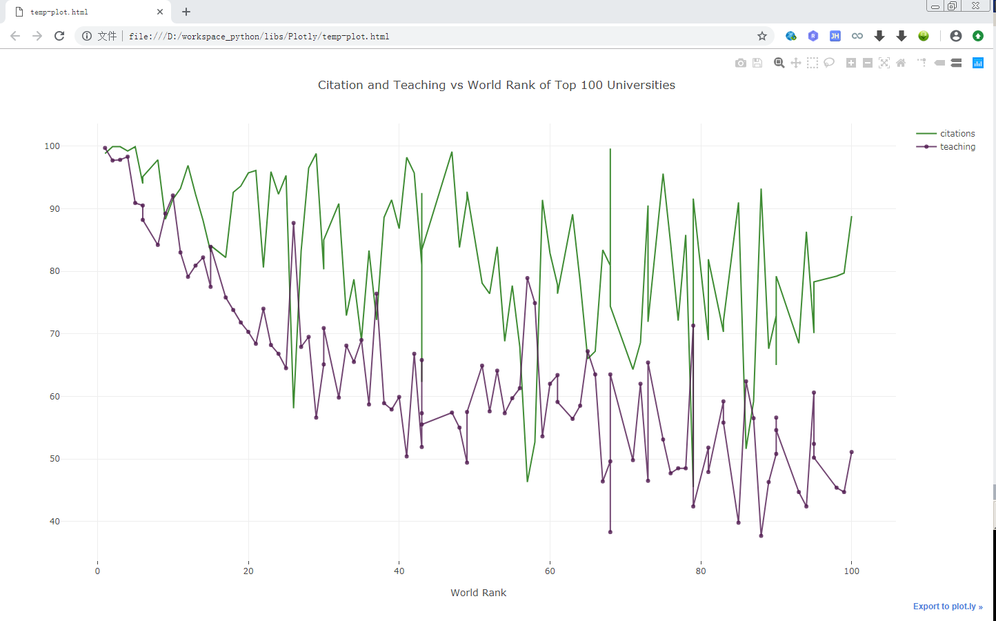
2. 折线图 Line Charts
2.1. 过程说明
- 导入数据
- 创建 trace
- x = x 轴数据
- y = y 轴数据
- mode = 绘制标记的类型
- name = 图例名称
- marker = 标记的样式
- color = 线条的颜色,使用 RGB 定义
- text = 坐标的名字
- data = 一个列表,表示要绘制的数据
- layout = 一个字典,表示布局信息
- title = 图标的标题
- x axis = 表示 x 轴的样式信息
- title = x 轴的标签
- ticklen = x 轴坐标轴上竖线的长度
- zeroline = 布尔值,是否显示0坐标位置的线条,也就是 y 轴
- fig = 一个包含数据和布局信息的字典
- plot = 绘制图形,这里采用本地离线方式绘制
2.2. 示例
1 | import plotly as plt |
执行成功之后,会在浏览器中打开一个页面:
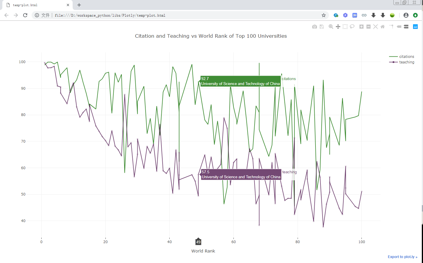
当鼠标在图形上移动时,会有实时的反馈数据出来:
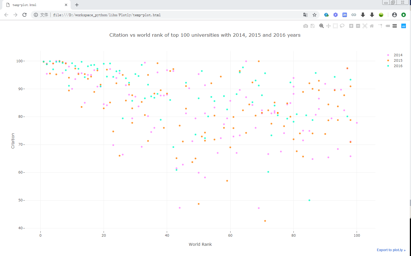
3. 散点图 Scatter
1 | import plotly as plt |
效果图:
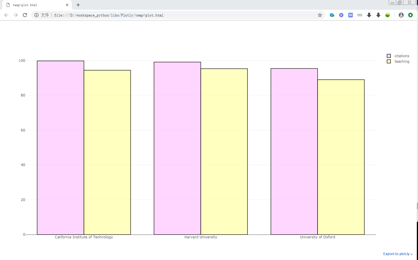
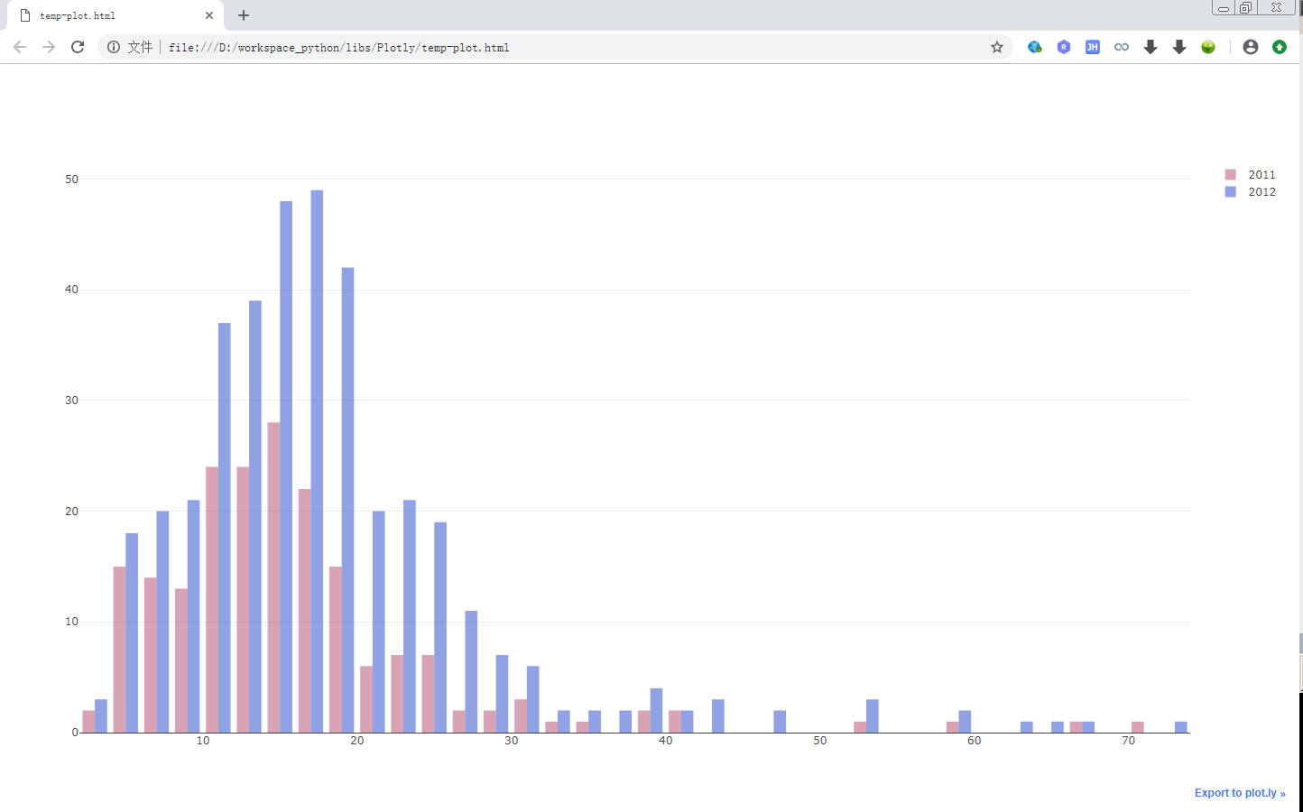
4. 柱状图
1 | import plotly.graph_objs as go |
效果图:
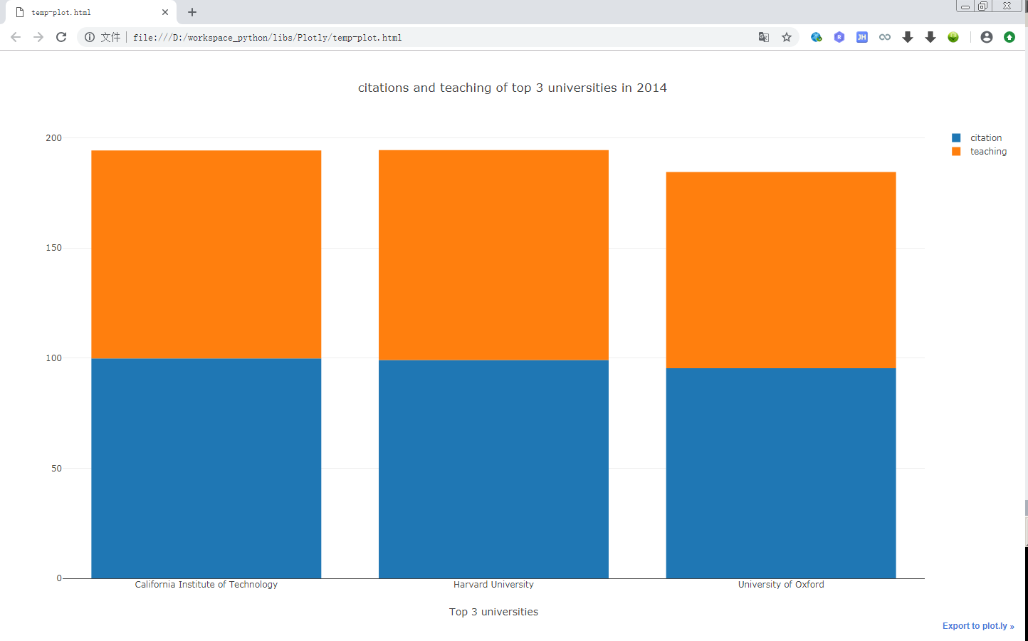
5. 堆叠柱状图
1 | import plotly.graph_objs as go |
效果图:
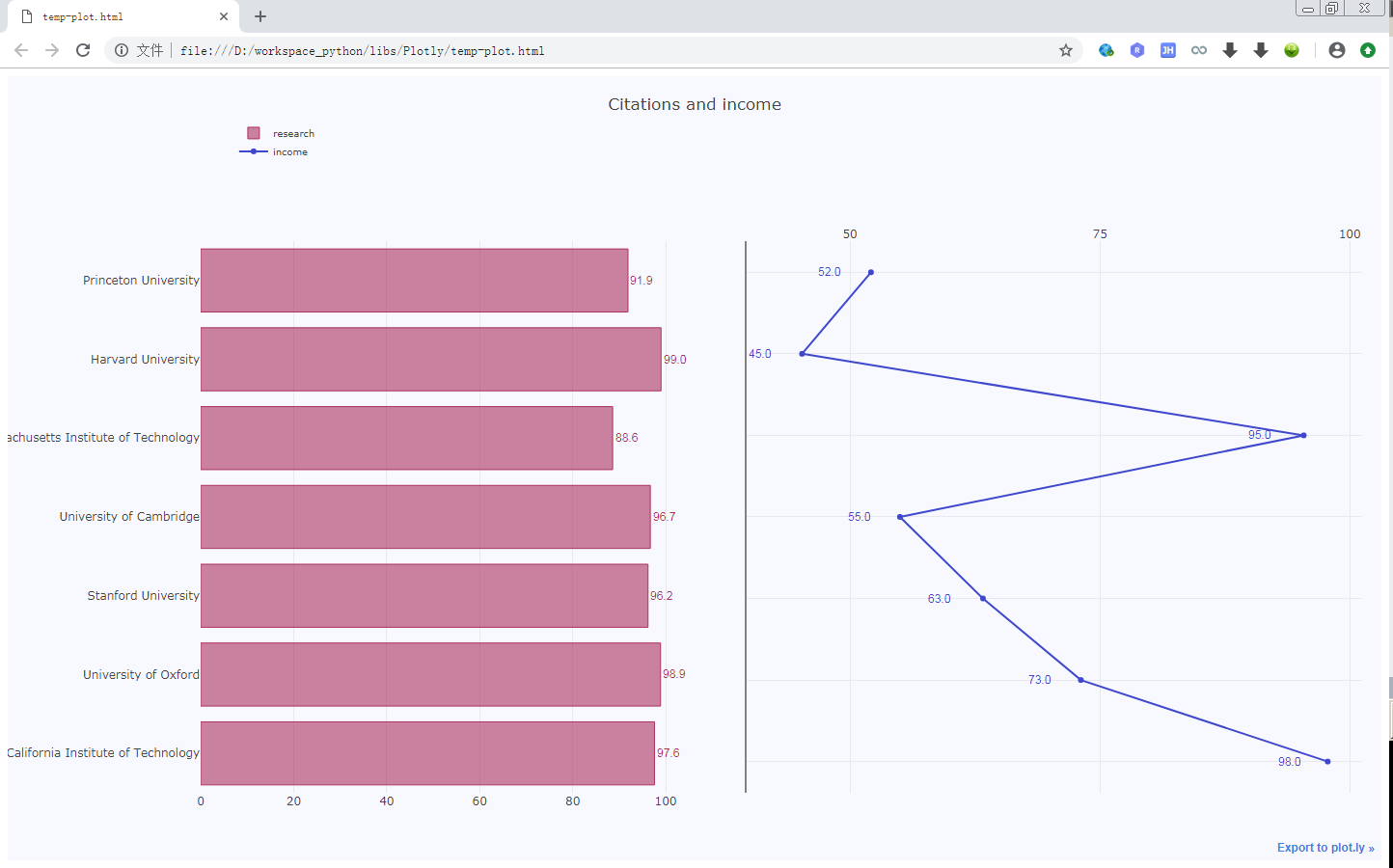
6. 带折线图的柱状图
1 | import numpy as np |
效果图:
7. 饼状图
1 | import numpy as np |
效果:

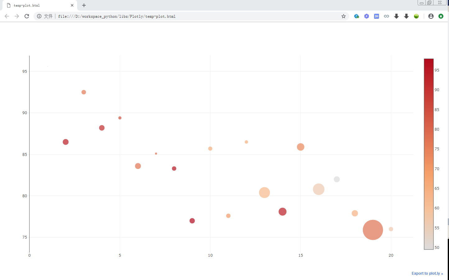
8. 气泡图 Bubble Charts
1 | import plotly.offline as pltof |
效果图:
9. 直方图
1 | import plotly.graph_objs as go |
效果图:
10. 词云 Word Cloud
1 | import pandas as pd |
效果图:

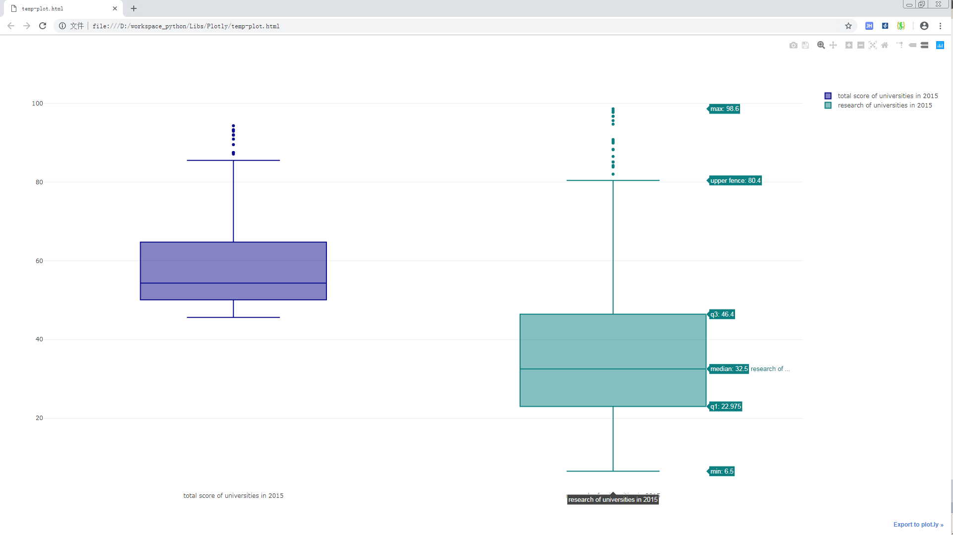
11. 箱线图
1 | import pandas as pd |
效果图:
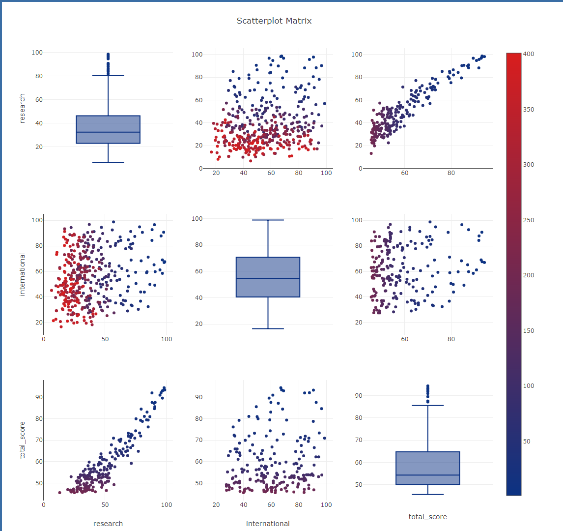
12. 散点矩阵图
1 | import numpy as np |
效果图:
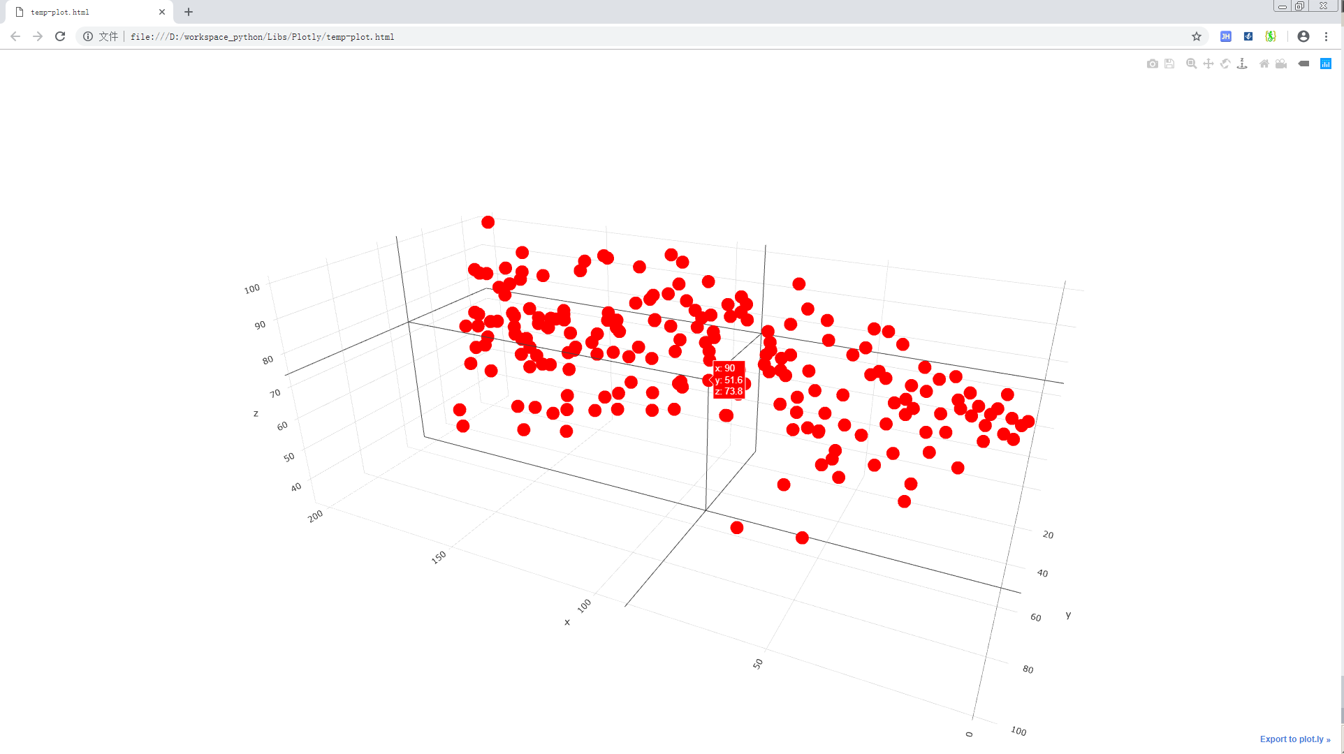
13. 3D 散点图
1 | import numpy as np |
效果图:
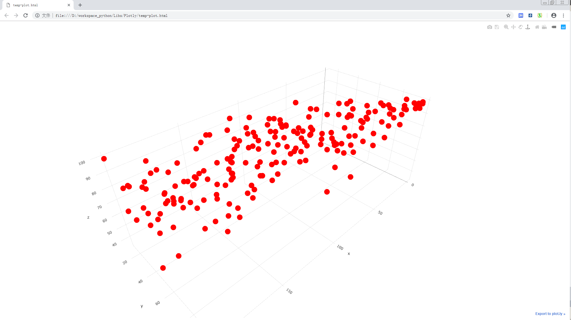
查看具体点的信息: