摘要 Matplotlib 是一个 Python 的可视化类库,用于开发二维和三维图表。最近几年,它被广泛的应用于科学和工程领域。
1. Matplotlib 架构 Matplotlib 架构从逻辑上分为三层,位于三个不同的层级上。上层内容可以与下层内容进行通讯,但下层内容不可以与上层内容通讯。
三层从上至下依次是:
1.1. Backend 层 位于架构的最底层。这一层包含了 matplotlib 的 API,也就是若干类的集合,这些类用来在底层实现各种图形元素。主要包括:
FigureCanves —— 用来表示图形的绘制区域
Renderer —— 用来在 FigureCanves 上绘制内容的对象
Event —— 用来处理用户输入(键盘、鼠标输入)的对象
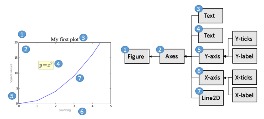
1.2. Artist 层 整个架构的中间层,所有用来构成一个图像的各种元素都在这里,比如标题、坐标轴、坐标轴标签、标记等内容都是 Artist 的实例。并且这些元素构成了一个层级结构。
Artist 分为两类,一类是 primitive artist,一类是 composite artist:
Primitive artist 是包含基本图形的独立元素,例如一个矩形、一个圆或者是一个文本标签
Composite artist 是这些简单元素的组合,比如横坐标、纵坐标、图形等
在处理这一层内容的时候,主要打交道的都是上层的图形结构,需要理解其中每个对象在图形中所代表的含义。下图表示了一个 Artist 对象的结构。
1.3. Scripting 层 该层包含了一个 pyplot 接口。这个包提供了经典的 Python 接口,基于编程的方式操作 matplotlib,它有自己的命名空间,需要导入 NumPy包。
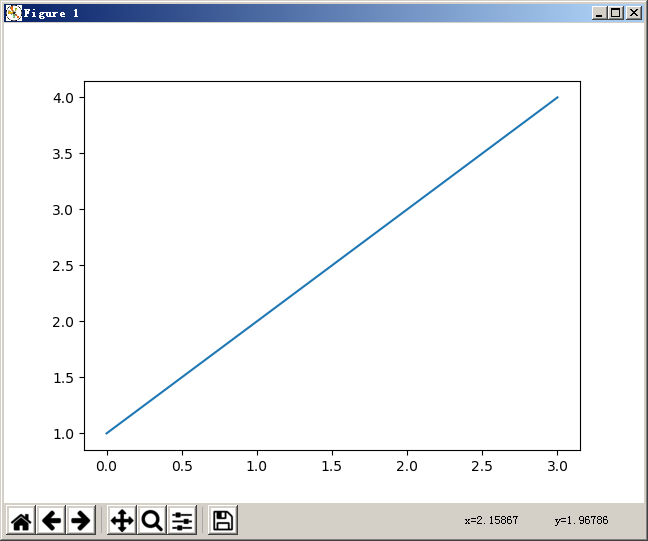
2. 绘制图形 2.1. 简单示例 1 2 3 import matplotlib.pyplot as pltprint(plt.plot([1 , 2 , 3 , 4 ]))
打印输出:
1 [<matplotlib.lines.Line2D object at 0x000000000D55EB70 >]
这里创建了一个 Line2D 对象。这个对象是一条符合给定点趋势的直线。接下来我们可以使用一个命令来将这个图片显示出来:
显示结果:
这个显示出来的窗口被称为 plotting window,这个窗口上有一些工具栏可以用来修改图形。
这里我们只给 plot() 方法传入了一个数字列表或数字数组,那么这个数组表示的是 y 坐标的点,对应每个点默认的 x 坐标的值是 0, 1, 2, 3, ... 。
如果要正确的绘制图形,那么应该给定明确的横坐标和纵坐标,也就是需要给定两个数组,第一个表示 x 轴,第二个表示 y 轴。此外,plot() 方法还可以接受第三个参数,用于表示绘制图形的属性。
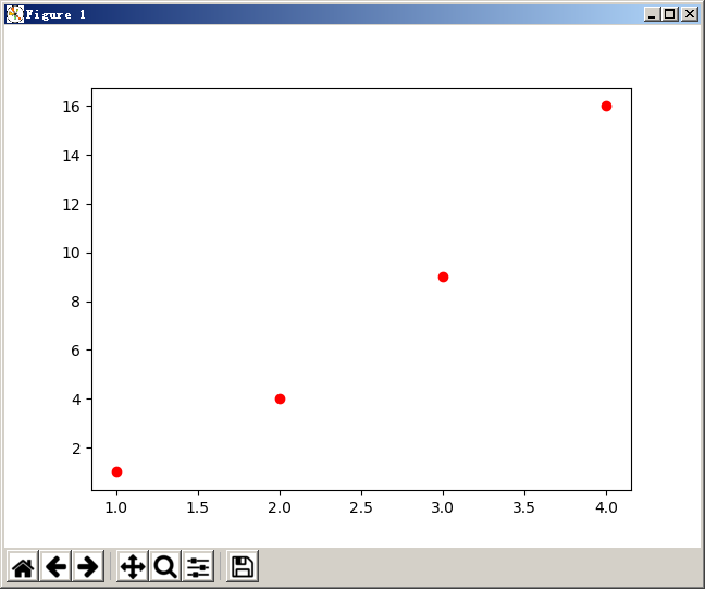
2.2. 设置样式 1 2 3 4 import matplotlib.pyplot as pltplt.plot([1 , 2 , 3 , 4 ], [1 , 4 , 9 , 16 ], 'ro' ) plt.show()
显示结果:
设置坐标样式
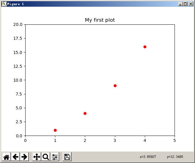
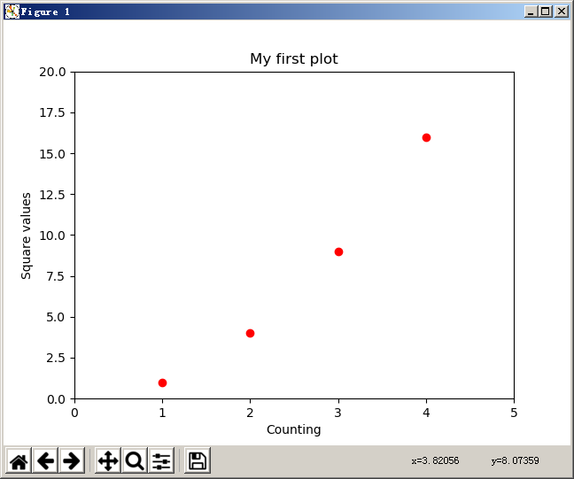
1 2 3 4 5 6 import matplotlib.pyplot as pltplt.axis([0 , 5 , 0 , 20 ]) plt.title("My first plot" ) plt.plot([1 , 2 , 3 , 4 ], [1 , 4 , 9 , 16 ], 'ro' ) plt.show()
显示结果:
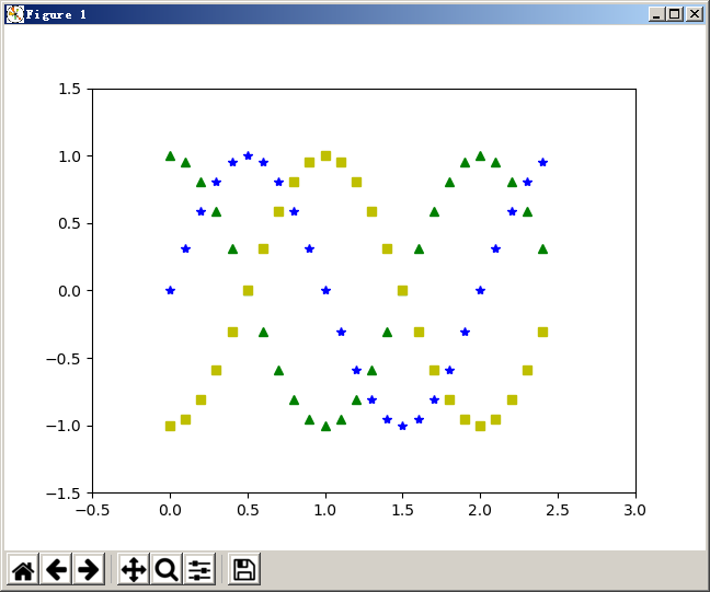
2.3. 在一个图上绘制多条线 这里使用 sin() 函数来绘制三角函数的图形。
1 2 3 4 5 6 7 8 9 10 11 12 13 import mathimport numpy as npimport matplotlib.pyplot as pltt = np.arange(0 , 2.5 , 0.1 ) y1 = np.sin(math.pi * t) y2 = np.sin(math.pi * t + math.pi / 2 ) y3 = np.sin(math.pi * t - math.pi / 2 ) plt.axis([-0.5 , 3 , -1.5 , 1.5 ]) plt.plot(t, y1, 'b*' , t, y2, 'g^' , t, y3, 'ys' ) plt.show()
显示结果:
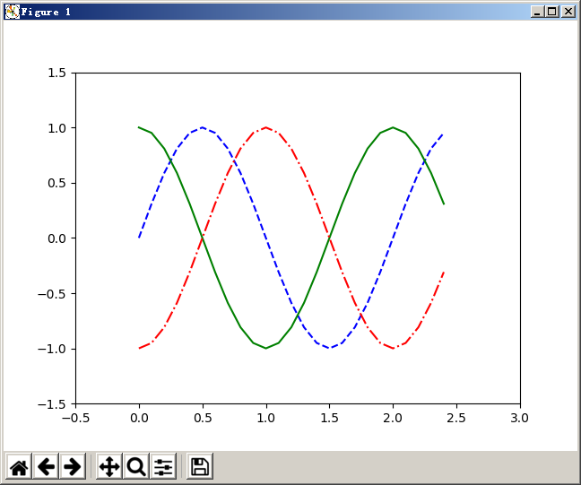
还可以修改线条的样式:
1 plt.plot(t, y1, 'b--' , t, y2, 'g' , t, y3, 'r-.' )
显示结果:
2.4. 使用关键字参数 之前在使用 plot() 方法绘制线条时,传入了一些参数,该方法还提供了很多参数以供使用,具体可以参考:
matplotlib.lines.Line2D
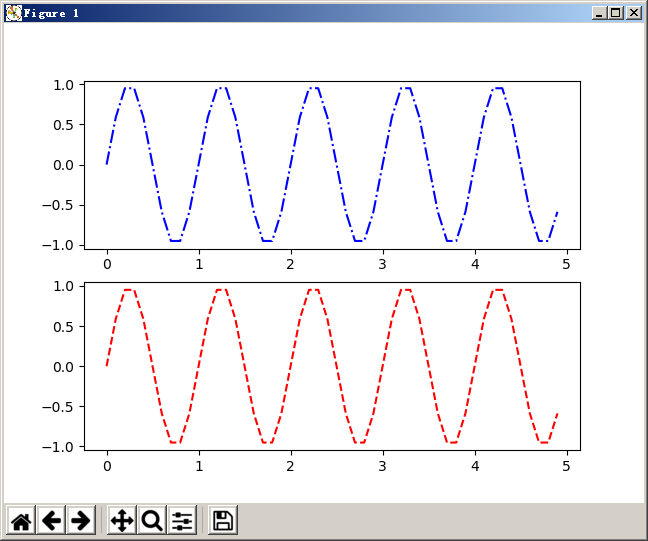
2.5. 在一个窗口绘制多个图形 如果需要在一个窗口绘制多个图形,那么可以使用 subplot() 方法设置当前图形所位于整个窗口的位置。然后使用 plot() 方法绘制当前区域的图形即可。
1 2 3 4 5 6 7 8 9 10 11 12 13 14 15 16 import mathimport numpy as npimport matplotlib.pyplot as pltt = np.arange(0 ,5 , 0.1 ) y1 = np.sin(2 * np.pi * t) y2 = np.sin(2 * np.pi * t) plt.subplot(211 ) plt.plot(t, y1, 'b-.' ) plt.subplot(212 ) plt.plot(t, y2, 'r--' ) plt.show()
显示结果:
2.6. 设置标签 2.6.1. 设置坐标轴标签 前面已经用过使用 title() 方法设置图形的标题,另外还有方法可以设置坐标的标签。
1
2
3
4
5
6
7
8
import matplotlib.pyplot as pltplt.axis([0 , 5 , 0 , 20 ]) plt.title("My first plot" ) plt.xlabel("Counting" ) plt.ylabel("Square values" ) plt.plot([1 , 2 , 3 , 4 ], [1 , 4 , 9 , 16 ], 'ro' ) plt.show()
显示结果:
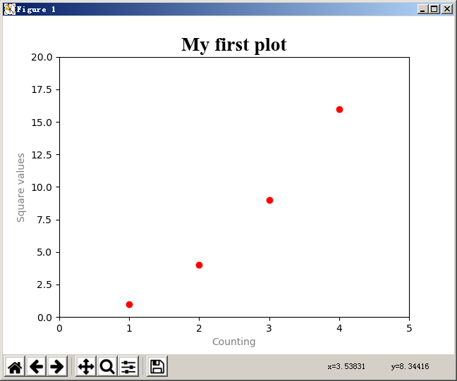
设置字体
1 2 3 plt.title("My first plot" , fontsize = 20 , fontname = 'Times New Roman' ) plt.xlabel("Counting" , color = 'gray' ) plt.ylabel("Square values" , color = 'gray' )
显示结果:
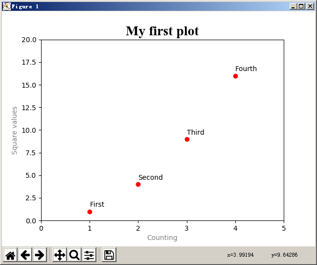
2.6.2. 设置数据点标签 1 2 3 4 5 6 7 8 9 10 11 12 13 14 import matplotlib.pyplot as pltplt.axis([0 , 5 , 0 , 20 ]) plt.title("My first plot" , fontsize = 20 , fontname = 'Times New Roman' ) plt.xlabel("Counting" , color = 'gray' ) plt.ylabel("Square values" , color = 'gray' ) plt.text(1 , 1.5 , 'First' ) plt.text(2 , 4.5 , 'Second' ) plt.text(3 , 9.5 , 'Third' ) plt.text(4 , 16.5 , 'Fourth' ) plt.plot([1 , 2 , 3 , 4 ], [1 , 4 , 9 , 16 ], 'ro' ) plt.show()
显示结果:
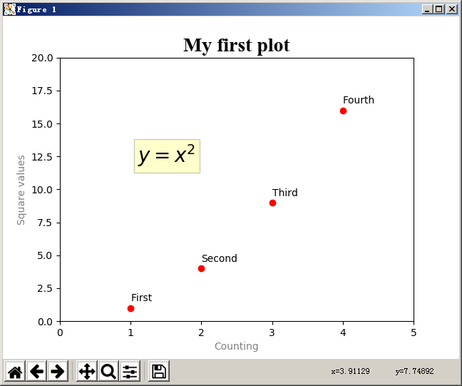
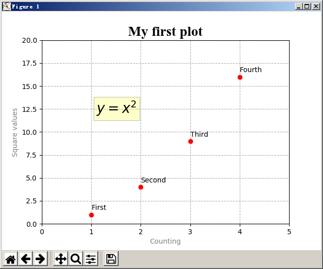
2.6.3. 添加 LaTex 表达式 1 plt.text(1.1 , 12 , r'$y=x^2$' , fontsize=20 ,bbox={'facecolor' :'yellow' , 'alpha' : 0.2 })
显示结果:
2.6.4. 添加网格 1 plt.grid(linestyle='--' )
显示结果:
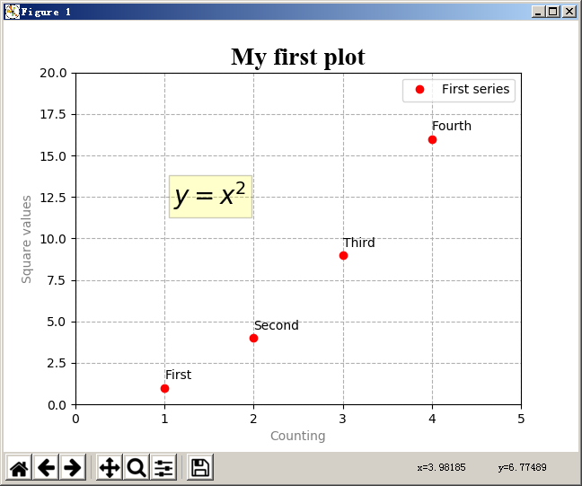
2.6.5. 添加图例 1 2 3 4 5 6 7 8 9 10 11 12 13 14 15 16 17 18 19 import matplotlib.pyplot as pltplt.axis([0 , 5 , 0 , 20 ]) plt.title("My first plot" , fontsize = 20 , fontname = 'Times New Roman' ) plt.xlabel("Counting" , color = 'gray' ) plt.ylabel("Square values" , color = 'gray' ) plt.text(1 , 1.5 , 'First' ) plt.text(2 , 4.5 , 'Second' ) plt.text(3 , 9.5 , 'Third' ) plt.text(4 , 16.5 , 'Fourth' ) plt.text(1.1 , 12 , r'$y=x^2$' , fontsize=20 ,bbox={'facecolor' :'yellow' , 'alpha' : 0.2 }) plt.grid(linestyle='--' ) plt.plot([1 , 2 , 3 , 4 ], [1 , 4 , 9 , 16 ], 'ro' ) plt.legend(['First series' ]) plt.show()
显示结果:
注意,添加的图例中接受的是一个数组,数组中元素的顺序与 plot() 方法绘制的元素顺序对应。
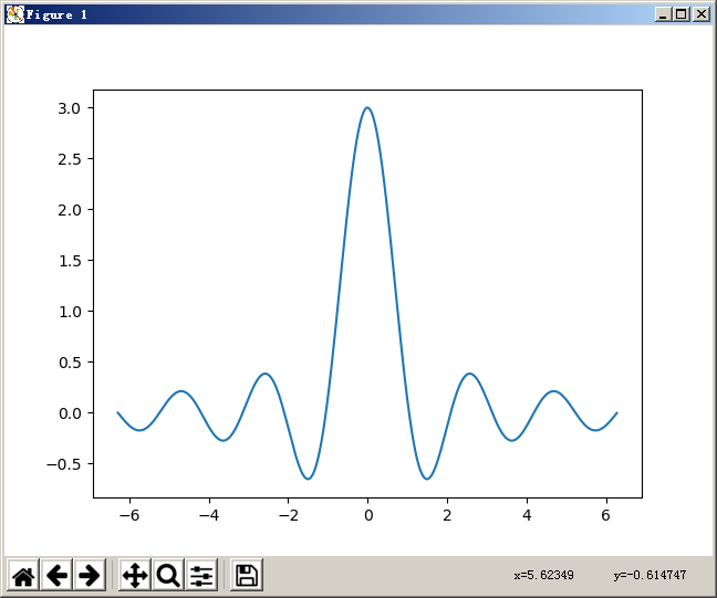
3. 常用图表 3.1. 折线图(Line Charts) 折线图的思路是给定 x 一个细密度的坐标数组,给定 y 一个以 x 作为变量的表达式进行绘制。
1
2
3
4
5
6
7
import numpy as npimport matplotlib.pyplot as pltx = np.arange(-2 * np.pi, 2 * np.pi, 0.01 ) y = np.sin(3 * x) / x plt.plot(x, y) plt.show()
显示结果:
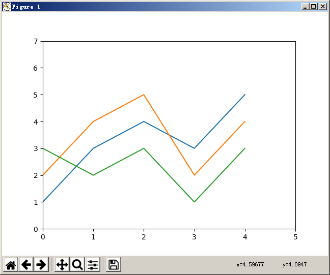
3.1.1. 用 Pandas 绘制 1 2 3 4 5 6 7 8 9 10 11 12 13 14 15 16 import numpy as npimport matplotlib.pyplot as pltimport pandas as pddata = { 'series1' :[1 ,3 ,4 ,3 ,5 ], 'series2' :[2 ,4 ,5 ,2 ,4 ], 'series3' :[3 ,2 ,3 ,1 ,3 ] } df = pd.DataFrame(data) x = np.arange(5 ) plt.axis([0 ,5 ,0 ,7 ]) plt.plot(x, df) plt.show()
显示结果:
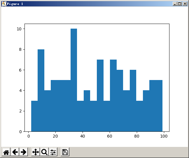
3.2. 直方图(Histograms) 使用 hist() 方法绘制直方图。
1
2
3
pop = np.random.randint(0 ,100 ,100 ) n, bins, patches = plt.hist(pop, bins=20 ) plt.show()
显示结果:
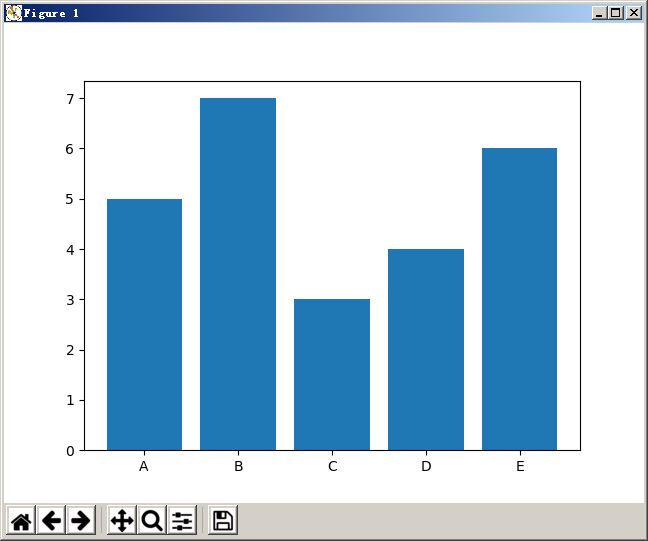
3.3. 柱状图(Bar Charts) 柱状图与直方图非常相似,但是注意,柱状图的横坐标是分类,而不是连续型的值。
1
2
3
4
5
index = [0 ,1 ,2 ,3 ,4 ] values = [5 ,7 ,3 ,4 ,6 ] plt.bar(index,values) plt.xticks(index,['A' ,'B' ,'C' ,'D' ,'E' ]) plt.show()
显示结果:
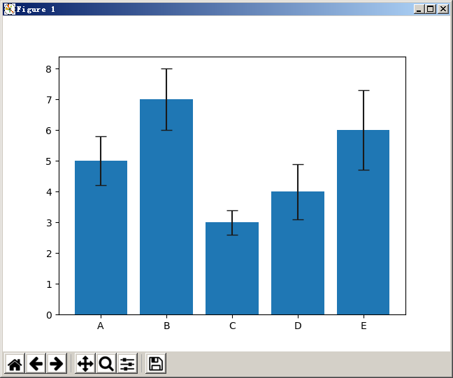
3.3.1. 标准差 1 2 3 4 5 6 index = [0 ,1 ,2 ,3 ,4 ] values = [5 ,7 ,3 ,4 ,6 ] std = [0.8 ,1 ,0.4 ,0.9 ,1.3 ] plt.bar(index, values, yerr=std, error_kw={'ecolor' :'0.1' , 'capsize' :6 }) plt.xticks(index, ['A' ,'B' ,'C' ,'D' ,'E' ]) plt.show()
显示结果:
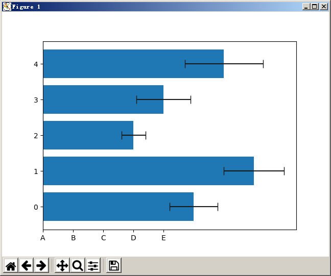
3.3.2. 水平柱状图 1 2 3 4 5 6 index = [0 ,1 ,2 ,3 ,4 ] values = [5 ,7 ,3 ,4 ,6 ] std = [0.8 ,1 ,0.4 ,0.9 ,1.3 ] plt.barh(index, values, xerr=std, error_kw={'ecolor' :'0.1' , 'capsize' :6 }) plt.xticks(index, ['A' ,'B' ,'C' ,'D' ,'E' ]) plt.show()
显示结果:
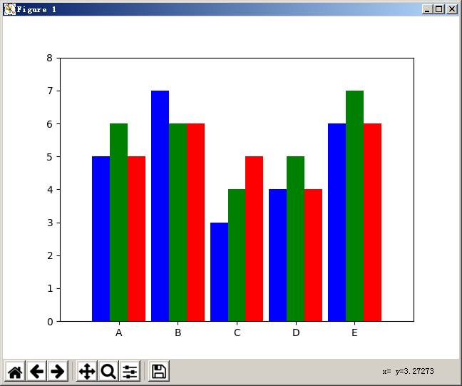
3.3.3. 多列柱状图 1 2 3 4 5 6 7 8 9 10 11 index = np.array([1 ,2 ,3 ,4 ,5 ]) values1 = [5 ,7 ,3 ,4 ,6 ] values2 = [6 ,6 ,4 ,5 ,7 ] values3 = [5 ,6 ,5 ,4 ,6 ] bw=0.3 plt.axis([0 , 6 , 0 , 8 ]) plt.bar(index-bw, values1, bw, color='b' ) plt.bar(index, values2, bw, color='g' ) plt.bar(index+bw, values3, bw, color='r' ) plt.xticks(index, ['A' ,'B' ,'C' ,'D' ,'E' ]) plt.show()
显示结果:
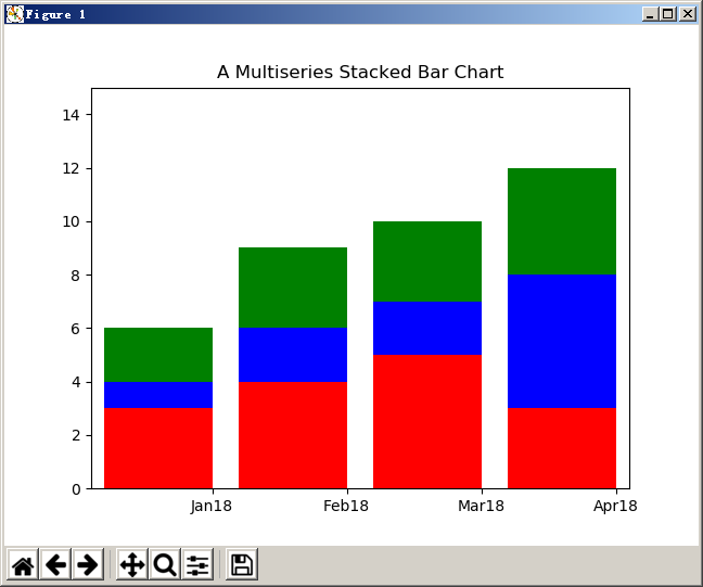
3.3.4. 堆叠柱状图 1 2 3 4 5 6 7 8 9 10 11 series1 = np.array([3 ,4 ,5 ,3 ]) series2 = np.array([1 ,2 ,2 ,5 ]) series3 = np.array([2 ,3 ,3 ,4 ]) index = np.arange(4 ) plt.axis([-0.5 ,3.5 ,0 ,15 ]) plt.title('A Multiseries Stacked Bar Chart' ) plt.bar(index,series1,color='r' ) plt.bar(index,series2,color='b' ,bottom=series1) plt.bar(index,series3,color='g' ,bottom=(series2+series1)) plt.xticks(index+0.4 ,['Jan18' ,'Feb18' ,'Mar18' ,'Apr18' ]) plt.show()
显示结果:
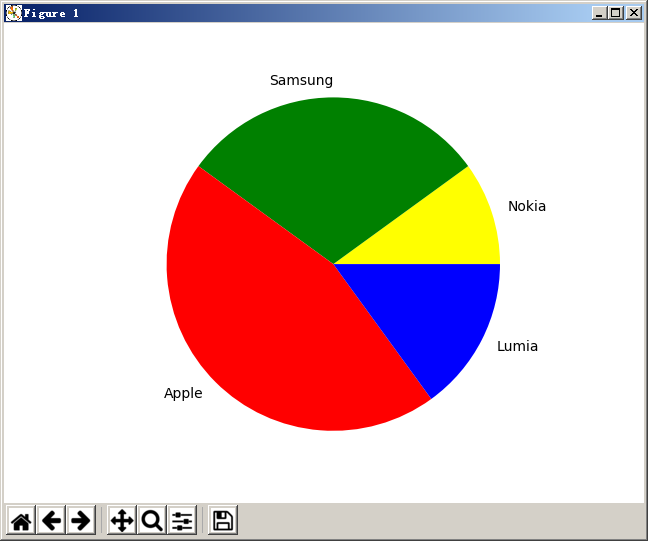
3.4. 饼状图(Pie Charts) 1 2 3 4 5 6 7 labels = ['Nokia' ,'Samsung' ,'Apple' ,'Lumia' ] values = [10 ,30 ,45 ,15 ] colors = ['yellow' ,'green' ,'red' ,'blue' ] plt.pie(values,labels=labels,colors=colors) plt.axis('equal' ) plt.show()
显示结果:
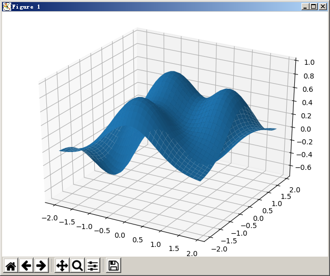
4. 3D 图形 4.1. 3D 曲面 1 2 3 4 5 6 7 8 9 10 11 12 13 14 15 import numpy as npfrom mpl_toolkits.mplot3d import Axes3Dimport matplotlib.pyplot as pltfig = plt.figure() ax = Axes3D(fig) X = np.arange(-2 ,2 ,0.1 ) Y = np.arange(-2 ,2 ,0.1 ) X,Y = np.meshgrid(X,Y) def f (x,y) : return (1 - y**5 + x**5 )*np.exp(-x**2 -y**2 ) ax.plot_surface(X,Y,f(X,Y), rstride=1 , cstride=1 ) plt.show()
显示结果:
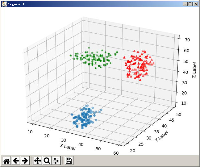
4.2. 3D 散点图 1 2 3 4 5 6 7 8 9 10 11 12 13 14 15 16 17 18 19 20 21 22 import numpy as npfrom mpl_toolkits.mplot3d import Axes3Dimport matplotlib.pyplot as pltxs = np.random.randint(30 ,40 ,100 ) ys = np.random.randint(20 ,30 ,100 ) zs = np.random.randint(10 ,20 ,100 ) xs2 = np.random.randint(50 ,60 ,100 ) ys2 = np.random.randint(30 ,40 ,100 ) zs2 = np.random.randint(50 ,70 ,100 ) xs3 = np.random.randint(10 ,30 ,100 ) ys3 = np.random.randint(40 ,50 ,100 ) zs3 = np.random.randint(40 ,50 ,100 ) fig = plt.figure() ax = Axes3D(fig) ax.scatter(xs,ys,zs) ax.scatter(xs2,ys2,zs2,c='r' ,marker='^' ) ax.scatter(xs3,ys3,zs3,c='g' ,marker='*' ) ax.set_xlabel('X Label' ) ax.set_ylabel('Y Label' ) ax.set_zlabel('Z Label' ) plt.show()
显示结果:
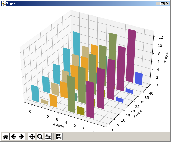
4.3. 3D 柱状图 1 2 3 4 5 6 7 8 9 10 11 12 13 14 15 16 17 18 19 20 21 22 23 import numpy as npfrom mpl_toolkits.mplot3d import Axes3Dimport matplotlib.pyplot as pltx = np.arange(8 ) y = np.random.randint(0 ,10 ,8 ) y2 = y + np.random.randint(0 ,3 ,8 ) y3 = y2 + np.random.randint(0 ,3 ,8 ) y4 = y3 + np.random.randint(0 ,3 ,8 ) y5 = y4 + np.random.randint(0 ,3 ,8 ) clr = ['#4bb2c5' , '#c5b47f' , '#EAA228' , '#579575' , '#839557' , '#958c12' , '#953579' , '#4b5de4' ] fig = plt.figure() ax = Axes3D(fig) ax.bar(x,y,0 ,zdir='y' ,color=clr) ax.bar(x,y2,10 ,zdir='y' ,color=clr) ax.bar(x,y3,20 ,zdir='y' ,color=clr) ax.bar(x,y4,30 ,zdir='y' ,color=clr) ax.bar(x,y5,40 ,zdir='y' ,color=clr) ax.set_xlabel('X Axis' ) ax.set_ylabel('Y Axis' ) ax.set_zlabel('Z Axis' ) ax.view_init(elev=40 ) plt.show()
显示结果: